| 10-04-2008, 06:24 PM | #1 |
![]() KR was working on this a bit, I'm really not sure what to make of it. I don't know if it even looks remotely representative of the map, might be better as a skill icon or something. I'm just not sure, it should probably also say Obsidian Depths somewhere across it. When I originally thought of what this should look like, I wanted it to look like Kazrah (Final boss), I'm not really sure if it's even distinguishable that this should be Kazrah or not! What do you all think? |
| 10-04-2008, 07:38 PM | #2 |
I think it looks bad ass, to be honest. It makes me think "Oh shit this will be hard" And yea, you could put "Obsidian Depths" in like, the top left or something but don't put it right over the picture. It's too awesome. EDIT: If I were KR I'd just sharpen it after it's finished, since now it looks kinda blurry. |
| 10-05-2008, 01:55 AM | #3 |
I was thinking maybe a shadow of the boss, with a ruined temple background(maybe just walls?), then he has red(or whatever color his eyes have) glowing eyes, and then "Obsidian Depths!" written below him. :D That one looks good I guess, but I don't think it's quite, representative as you said. |
| 10-05-2008, 05:38 AM | #4 |
I think it's awesome, but personally I'd tally up a few ideas/sketchy-pictures before asking about opinions. |
| 10-05-2008, 08:28 AM | #5 |
I think this looks very cool, and I don't even think it's necessary to have it say "Obsidian Depths" if this was recognizable as the last boss or if you had a larger version of this for the load screen that actually did say Obsidian Depths. |
| 10-05-2008, 08:40 AM | #6 |
I like it alot It doesnt look like it represents the map at all but it definetly doesnt NOT represent the map |
| 10-05-2008, 02:47 PM | #7 |
actually, the black stuff looks like obsidian, and that red thing looks like it extends further down... it's got DEPTH. |
| 10-05-2008, 05:26 PM | #8 | |
Hrm, yeah, I see what you're all saying. My thoughts are that a lot of different kinds of map preview images could do the map good, though because of that ambiguity it's tough to make the call and say which I want over the others.
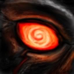
 Quote:
She came up with the idea when I told her to make his eyes look like the depths of madness. :p I'll probably end up using this until we figure out something better. |
| 10-05-2008, 05:49 PM | #9 |
Actually, I think it is quite good, abstract, and, considering what people usually put... great. |
| 10-05-2008, 06:28 PM | #10 |
I think it could use more emphasis on the eye for "depth." |
| 10-05-2008, 07:04 PM | #11 |
It's not like the image is centered on the eye or that the eye is the primary light source or something. :p |
| 10-05-2008, 07:09 PM | #12 |
I think its sexy personally |
| 10-06-2008, 12:45 AM | #13 | |
Quote:
|
| 10-06-2008, 01:38 AM | #14 |
KR did the image, Pyro. *cough* |
| 10-06-2008, 01:48 AM | #15 |
Yeah, not AR. :p And you know, I just realized that my monitor at home is too dark! The preview looks a lot cooler on my work computer when I can actually see half of it. >.> |
