


| 05-10-2009, 06:23 AM | #1 |
Blood Elf Watcher skin I created. 100% freehand, even the ring that hangs from her loincloth. Did most of it with a blood elf picture to look at and Warcraft3Viewer. Based primarily off of WoW blood elf armor, blood elves, and their hairdos. If you have any ideas on how to make it better let me know :) |
| 05-10-2009, 08:54 AM | #2 |
Nice, I love what you did with the hair. Are the eyebrows part of the helmet as well? Her face is great too :) |
| 05-10-2009, 09:30 AM | #3 |
Doubt it. Anyway, is the blue TC? |
| 05-10-2009, 11:50 AM | #4 |
It's good, but could be substantially better. The golden parts are quite blurry and cluttered, there's a lot going on and in-game that'll fall apart quite fast. I also feel like the TC shouldn't have a red overtone to it, since that will bleed with all of the TC colors to confuse people playing the game. Red + Blue = Purple and that's all sorts of confusing when they're all different player numbers. The shading on the red parts of the legs looks odd, since it gives it a plastic look as opposed to metal or protective. I like the gauntlet and the structure, but I feel that the composition could use a bit of work. Do you have an in-game screenshot from the in-game camera? |
| 05-10-2009, 06:42 PM | #5 | |||
Quote:
Ya, the top half of her eyebrows are on the helmet. Mostly because thier is a texture gap if you alpha out to much of her helmet at the top of her head :) Quote:
It's blue team TC on the one with her back turned to you. The middle one is red, and the one on the left and the in-game portrait views are all purple. Quote:
Well, that gives me something to work on :) I mostly kept the red undertone on the TC to see how it would turn out, looks ok on red, blue and purple but turns green a little brownish :/ btw, for the in-game screenshot do you care if the unit is cruising around on the outland abyss tileset or one I imported for that matter? |
| 05-11-2009, 07:52 PM | #6 | ||
Quote:
Quote:
|
| 05-12-2009, 01:10 AM | #7 |
That looks wicked, I love it chrome |
| 05-12-2009, 09:07 PM | #8 |
ok, shadded the armor a little more heavily to give it a more metalic look, sharpened the gold trim a bit, changed team color to have no undertone, and cleaned up various other things :) |
| 08-29-2009, 01:33 AM | #9 |
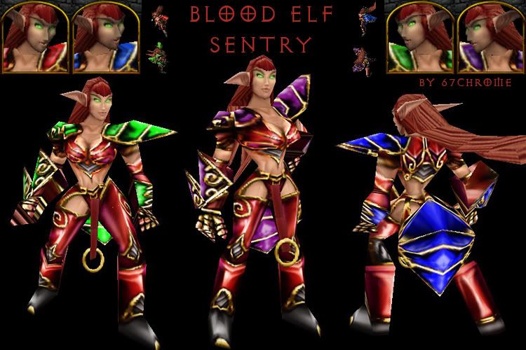 Ok, changed the skin a bit and figured I'd post what it looks like now. The little blood elves around the name are what the model looks like in-game, if they happen to be floating around in outland abyss. The rest of the screenshots were taken in the world editor :/ |
| 08-29-2009, 01:48 AM | #10 |
Well, it's looking better, but you've still got a really crackly and pixellated appearance for the bits of armor that you have detailed. It should look more fluid and solid; look at Arthas' shoulderpads for an example. |
| 08-29-2009, 02:13 AM | #11 |
Yeah, it appears too harsh and oversharpened. I appreciate that you're working in a very small area there (seriously, I feel your pain :P). As such, have you considered increasing the size for working on tricky areas then resizing back to 256 for export? High res isn't a dirty word, as long as you know what you're doing :) My only other beef is the highlights on the team colour. Currently, it really just looks muddy with the semitransparent thing going on there. Team colour looks best when it's over solid black and you use stronger alpha to highlight. For the highlighting thing, there are ways of making it work (see Unwirklich's stuff in the gallery). Overall though, it's looking quite nice, keep it up! |
| 08-30-2009, 09:33 PM | #12 |
Ya, team color has been a real pain to work with in this skin. Under it the shoulders are essentially just black and white, I must have re-done the team color a good ten times with this skin and figured it looked good enough as is. I might go back and fix it now that you mention it though. I'll work on reversing the sharpness of the armor details to, there really isn't that much space to work with them. @Dusk - which Arthas skin are you referring to btw? |