


| 06-14-2004, 08:37 AM | #1 |
Skin Completely done by me, Model done by: LacrosseTitans Kind of a 360 view (normal scale) Up close, (this is scale 3) UV: Body: Helmet, Shield: Face: |
| 06-14-2004, 09:27 AM | #2 |
nice model and skin, how are its animations? No point having a kickass model if it has screwed anims. |
| 06-14-2004, 09:51 AM | #3 |
It has run, stand, and attack anims, but its in its early stages. |
| 06-14-2004, 10:11 AM | #4 |
That's one hell of a good skin, *sends a rep*, and that model, it's fantastic too! Vagabond- |
| 06-14-2004, 10:35 AM | #5 |
really cool skin and model. but I feel the shield seems a bit too smooth, still gj |
| 06-14-2004, 10:51 AM | #6 |
face was CnP'd from the spellbreaker, but i see no problem to that, the armor makes up for most of it that is 1337or LOTR PWNAGE! |
| 06-14-2004, 11:16 AM | #7 |
Let's hope that the animations are not robotic. The model in close up looks really boxy, maybe tell him to fix that. How many polies btw? The skin looks really good. Perhaps add more detail to the shield. |
| 06-14-2004, 12:27 PM | #8 |
the skin can definetly use some more shading... especially in the metal, it misses that gondor shine imo... other then that its a pretty good model+skin... the hands are fucket up though o_O |
| 06-14-2004, 03:12 PM | #9 |
The legs and hands of the model need a bit o' work, but I think the skin is very nice. |
| 06-14-2004, 10:59 PM | #10 | |
Quote:
Well the face is the head from the spell breaker, so I didn't really have much of a choice =( |
| 06-15-2004, 03:19 AM | #11 |
Hands and feet dont matter, your not close enought to see it. Also I think metal should be shinier, since Gondor armor is shiny as fuck, its also got a pointy helmet, or maybe the spearmen dont. |
| 06-15-2004, 05:27 AM | #12 |
Nice work in general, good job on the helmet - well thought out. I dont like the shade of grey used but it works. I dont like the embossed tree symbols or whatever they are, it just doesnt seem something men would ware(sp?). Try not to use motion blur or textures or filters, hand drawn( mouse or wacom ) simply looks better, its something that always seems to be missing from your skins. A better screenshot within w3viewer would be nice. LacrosseTitans skins suffer because they are huge and really should be compiled into one single blp file. |
| 06-15-2004, 06:56 AM | #13 | |
Quote:
I didn't use motion blur, filters, or textures, I did it all with dodge and burn thank you very much, maybe you should try using the blur tool instead of gausian or motion blur, it works a lot better. And if you actually new what the armor looked like, you'd know they have the symbol of the white tree on their armor. |
| 06-15-2004, 07:27 AM | #14 |
Yeah I never knew that, but make it gold it will look better. Like in the reference. 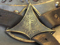 But if you dont want people to comment just say so guy... |
| 06-15-2004, 05:01 PM | #15 | |
Quote:
The armor isn't gold, its grey, and that buckle is green, it only looks gold because of the lighting. |