


| 02-12-2006, 02:47 PM | #1 |
Heres one of my all time favorite quotes:: JOEL: All right, Evil. This is the Last Call, with Carson Daly. I'm gonna take you out for good! And I don't mean to dinner. Although if we see an Arby's on the way, we'll go through the drive-thru. But no reach arounds! Alright, I didnt shade his right ear, for some reason. And the hat doesnt look like its on his head. And the guy is sitting weird.  Edit: Yo! "If it moves, chop it, if it aint movin', kick it den chop it" 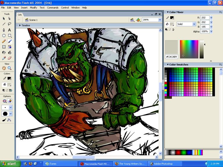 Almost finished...   |
| 02-12-2006, 07:36 PM | #2 |
Nice improvement. The sketchiness is okay but the muscles, hands and face structure are off. It's really a nice picture overall, I like this new stuff much more . But why a white background... and why don't you try PS or Painter and some opacity brush colouring? |
| 02-12-2006, 07:42 PM | #3 |
Because photoshop is like... I dunno... too "soft". I have to go over the lines like a bajillion times with opacity. Whats wrong wiv da muscles and head? I cant really fix it on nothing. I think its pretty right. On a completely different tangent ~ If you thought the Very Expensive Guys were very expensive that’s cause you haven’t seen the Very Expensive Tanks. The Very Expensive Tanks are like the Expensive Tanks you can buy in every shop but they are Very Expensive and you must import them from Mars, or England or somewhere. Then you must buy the Very Expensive Book so you can use them. What? You think the rules should come with the Very Expensive Tanks for free? You are a stupid head! Then you must convince other people to let you use the Very Expensive Tanks because the rules are optional and the only people who have seen them are people with the Very Expensive Book. Finally you must learn that the rules for the Very Expensive Tanks suck because they’re just for fun. We are GW, we are masters of marketing. – Sneak Preview of Codex Very Expensive Tanks |
| 02-12-2006, 08:21 PM | #4 |
I like your sig better. I read a whole bunch of your PFB (i think thats the name meh) cartoons at study period very hilarious stuff. I meant the hands and muscles are not very reallistic. You can say its a cartoony style but it cudve been better executed if you did anatomy studies. Something we all need to do. PS has some brushes that are not ''Soft''. |
| 02-12-2006, 09:18 PM | #5 |
Its not really a cartoony style, nor will I use the random excuse. But thanks for the response. On a completely random tangent~ no. |
| 02-14-2006, 12:46 PM | #6 |
wow! i love that orc! |
| 02-14-2006, 09:25 PM | #7 |
For a more "propa" spelling, its ork with a "k". This is the games workshop version. The more agressive always at war kind. None of that female orcs or stuff. |
| 02-15-2006, 01:15 AM | #8 |
Other than that the legs look a wee bit funny... I really like this piece. He looks like he's in an attack lunge, and I really dig the coloring. Good work Shadow. icbm1987 |
| 02-15-2006, 02:14 AM | #9 |
Hey b... you've known me since I started drawing. Do you remember how I used to draw?  Yay Improvement! |
| 02-15-2006, 02:48 AM | #10 |
Yeah. I see the improvement you've made, in just a few short months... and it makes me sad because I haven't improved as much or at all. Now, let's see some more work... eh? :P |